Saint John’s Cathederal Campaign Logo Design and Animation
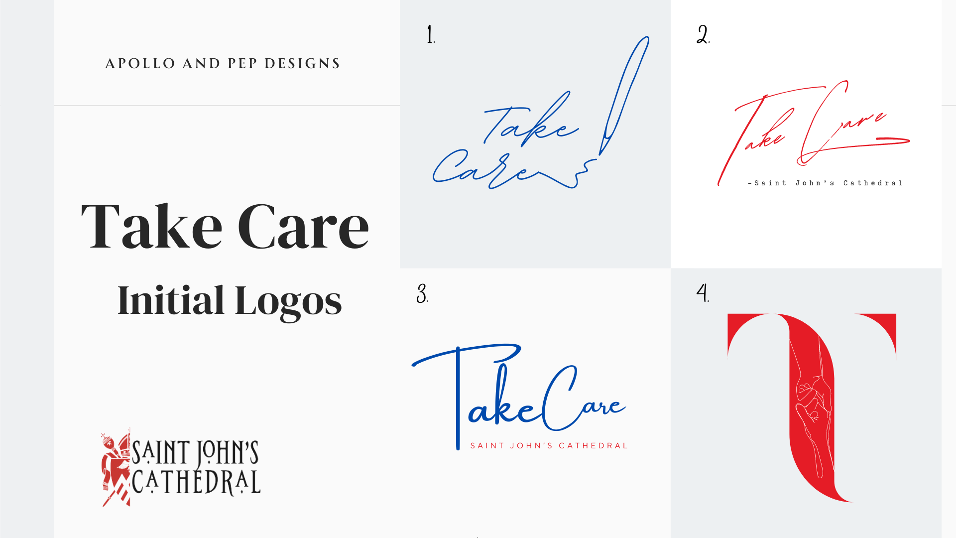
Saint John’s Cathederal had just wrapped up a big financial campaign focused on revitalizing the church grounds, buildings and other physical infrastructure. Due to the year long focus on revitalizing the physical structures and spaces, the Cathederal wanted to shift gears and bring the focus back to the community, people based programing and connection. The idea for the name of the campaign came from how the deacon signs off his emails “take care”. When designing the logo, the focus needed to be a personal and hand touched connection, while still being legible and understandable by an older audience.

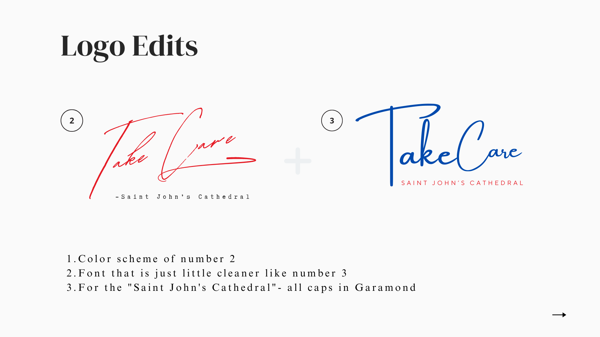
When we began our conversation about the logo design, there was an understanding that there were many groups of people who had differing priorities and ideas for the logo within the church that needed to approve the final design. Knowing this, I provided four designs with different focuses. I also created quick application sheets for each design to help decision makers get an idea of how the logo would shift to accommodate different applications (letter heads, web, advertisements, etc.) Based on feedback, I then designed the final Logo with a focus on easily readable handwriting and classic under text that all age groups could read and connect with. Below is a sneak peak into the evolution of the logo under these circumstances.
The Process: Why are there four initial logos?


All clients receive a Zip file organized based on logo block. You will recive the following:
ai master file of the logo design with each application design organized on a page for a designer to edit or shift based on your needs in the future.
PNG, SVG, PDF and EPS of each application design
Our PDF design powerpoint and communication process
My “Client File Format Guide” so you know when to use each file format type based on where you are using your new logo!
